Pulsing Heart CSS 애니메이션
저는 CSS로만 움직이는 하트 작업을하고 있습니다.
두 번 펄싱하고 잠시 휴식을 취한 다음 다시 반복합니다.
내가 지금 가지고있는 것 :
small ==> big ==> small ==> repeat animation
내가하려는 것 :
small ==> big ==> small ==> big ==> small ==> pause ==> repeat animation
어떻게하니?
내 코드 :
#button{
  width:450px;
  height:450px;
  position:relative;
  top:48px;
  margin:0 auto;
  text-align:center;
  }
#heart img{
  position:absolute;
  left:0;
  right:0;
  margin:0 auto;
  -webkit-transition: opacity 7s ease-in-out;
  -moz-transition: opacity 7s ease-in-out;
  -o-transition: opacity 7s ease-in-out;
  transition: opacity 7s ease-in-out;}

 @keyframes heartFadeInOut {
  0% {
    opacity:1;
  }
  14% {
    opacity:1;
  }
  28% {
    opacity:0;
  }
  42% {
    opacity:0;
  }
  70% {
    opacity:0;
  }
}

#heart img.top {
  animation-name: heartFadeInOut;
  animation-timing-function: ease-in-out;
  animation-iteration-count: infinite;
  animation-duration: 1s;
  animation-direction: alternate;

}
<div id="heart" >
<img class="bottom" src="https://goo.gl/nN8Haf" width="100px">
<img class="top" src="https://goo.gl/IIW1KE" width="100px">
</div>this Fiddle 도 참조하십시오 .
일시 중지를 애니메이션에 통합 할 수 있습니다. 이렇게 :
@keyframes heartbeat
{
  0%
  {
    transform: scale( .75 );
  }
  20%
  {
    transform: scale( 1 );
  }
  40%
  {
    transform: scale( .75 );
  }
  60%
  {
    transform: scale( 1 );
  }
  80%
  {
    transform: scale( .75 );
  }
  100%
  {
    transform: scale( .75 );
  }
}
작동 예 : https://jsfiddle.net/t7f97kf4/
@keyframes heartbeat
{
  0%
  {
    transform: scale( .75 );
  }
  20%
  {
    transform: scale( 1 );
  }
  40%
  {
    transform: scale( .75 );
  }
  60%
  {
    transform: scale( 1 );
  }
  80%
  {
    transform: scale( .75 );
  }
  100%
  {
    transform: scale( .75 );
  }
}

div
{
  background-color: red;
  width: 50px;
  height: 50px;
  animation: heartbeat 1s infinite;
}
<div>
Heart
</div>편집하다:
순수한 CSS 하트 모양을 사용한 작업 예제 : https://jsfiddle.net/qLfg2mrd/
@keyframes heartbeat
{
  0%
  {
    transform: scale( .75);
  }

  20%
  {
    transform: scale( 1);
  }

  40%
  {
    transform: scale( .75);
  }

  60%
  {
    transform: scale( 1);
  }
  80% {
    transform: scale( .75);
  }

  100%
  {
    transform: scale( .75);
  }
}

#heart
{
  position: relative;
  width: 100px;
  height: 90px;
  animation: heartbeat 1s infinite;
}

#heart:before,
#heart:after
{
  position: absolute;
  content: "";
  left: 50px;
  top: 0;
  width: 50px;
  height: 80px;
  background: red;
  -moz-border-radius: 50px 50px 0 0;
  border-radius: 50px 50px 0 0;
  -webkit-transform: rotate(-45deg);
  -moz-transform: rotate(-45deg);
  -ms-transform: rotate(-45deg);
  -o-transform: rotate(-45deg);
  transform: rotate(-45deg);
  -webkit-transform-origin: 0 100%;
  -moz-transform-origin: 0 100%;
  -ms-transform-origin: 0 100%;
  -o-transform-origin: 0 100%;
  transform-origin: 0 100%;
}

#heart:after
{
  left: 0;
  -webkit-transform: rotate(45deg);
  -moz-transform: rotate(45deg);
  -ms-transform: rotate(45deg);
  -o-transform: rotate(45deg);
  transform: rotate(45deg);
  -webkit-transform-origin: 100% 100%;
  -moz-transform-origin: 100% 100%;
  -ms-transform-origin: 100% 100%;
  -o-transform-origin: 100% 100%;
  transform-origin: 100% 100%;
}
<div id="heart"></div>맥박 2 회, 잠시 휴식을 취한 후 다시 반복하십시오.
이 시도. 애니메이션 opacity을 사용하는 것은 나쁜 선택입니다. transform: scale()일을 할 것입니다.
.heart:before {
  display: block;
  position: absolute;
  top: 0;
  left: 0;
  width: 100%;
  font-family: 'icons';
  font-size: 21px;
  text-indent: 0;
  font-variant: normal;
  line-height: 21px;
}
.heart {
  position: relative;
  width: 500px;
  overflow: inherit;
  margin: 50px auto;
  list-style: none;
  -webkit-animation: animateHeart 2.5s infinite;
  animation: animateHeart 2.5s infinite;
}
.heart:before,
.heart:after {
  position: absolute;
  content: '';
  top: 0;
  left: 50%;
  width: 120px;
    height: 200px;
    background: red;
    border-radius: 100px 100px 0 0;
  -webkit-transform: rotate(-45deg) translateZ(0);
  transform: rotate(-45deg) translateZ(0);
  -webkit-transform-origin: 0 100%;
  transform-origin: 0 100%;
}
.heart:after {
  left: 26%;
  -webkit-transform: rotate(45deg) translateZ(0);
  transform: rotate(45deg) translateZ(0);
  -webkit-transform-origin: 100% 100%;
  transform-origin: 100% 100%;
}
@-webkit-keyframes animateHeart {
  0% {
    -webkit-transform: scale(0.8);
  }
  5% {
    -webkit-transform: scale(0.9);
  }
  10% {
    -webkit-transform: scale(0.8);
  }
  15% {
    -webkit-transform: scale(1);
  }
  50% {
    -webkit-transform: scale(0.8);
  }
  100% {
    -webkit-transform: scale(0.8);
  }
}
@keyframes animateHeart {
  0% {
    transform: scale(0.8);
  }
  5% {
    transform: scale(0.9);
  }
  10% {
    transform: scale(0.8);
  }
  15% {
    transform: scale(1);
  }
  50% {
    transform: scale(0.8);
  }
  100% {
    transform: scale(0.8);
  }
}
span {
  font-family: 'Cantora One', sans-serif;
  font-size: 64px;
  position: absolute;
  top: 165px;
}
<div class="heart">
</div>같은 I 케탄 의 대답은,하지만 난 그게 더 현실적인 만들기 위해 심장 애니메이션을 개선하고 싶었다.
- 심장이 뛰더라도 크기가 두 배가되지는 않습니다. 크기가 10 % 변경된 것 같습니다.
- 나는 모두가 큰 점점 좋아 작은
- 그것이 완전히 움직이지 않으면 그것은 나에게 죽은 것처럼 보입니다. 뛰지 않을 때도 약간 확장하거나 축소해야합니다
- 매번 같은 방식으로 실행되도록 "대체 방향"코드를 제거했습니다.
- 나는 명시 적으로 하트 시작 끝과 정상 스케일 (1)을 가지고 있으며 시퀀스 중간에 애니메이션이 있습니다. 저에게는 그렇게 분명해 보입니다.
#heart img{
position:absolute;
left:0;
right:0;
margin:0 auto;
}
@keyframes heartFadeInOut {
0% {transform: scale(1);}
25% {transform: scale(.97);}
35% {transform: scale(.9);}
45% {transform: scale(1.1);}
55% {transform: scale(.9);}
65% {transform: scale(1.1);}
75% {transform: scale(1.03);}
100% {transform: scale(1);}
}
#heart img.bottom {
animation-name: heartFadeInOut;
animation-iteration-count: infinite;
animation-duration: 2s;
}<div id="heart" >
<img class="bottom" src="https://i.stack.imgur.com/iBCpb.png" width="100px">
</div>다양한 댓글과 ♥를 사용하여 다음과 같은 정보를 얻을 수 있습니다.
body {
font-size: 40pt;
color: red;
}
@keyframes heartbeat {
0% {
font-size: .75em;
}
20% {
font-size: 1em;
}
40% {
font-size: .75em;
}
60% {
font-size: 1em;
}
80% {
font-size: .75em;
}
100% {
font-size: .75em;
}
}
div {
animation: heartbeat 1s infinite;
}<div>
♥
</div>body{
margin: 0;
padding: 0;
background: #1f1f1f;
}
body:before
{
position: absolute;
content: '';
left: 50%;
width: 50%;
height: 100%;
background: rgba(0,0,0,.2);
}
.center
{
position: absolute;
top:50%;
left: 50%;
background: #1f1f1f;
transform: translate(-50%,-50%);
padding: 100px;
border: 5px solid white;
border-radius: 100%;
box-shadow:20px 20px 45px rgba(0,0,0,.4);
z-index: 1;
overflow: hidden;
}
.heart
{
position: relative;
width: 100px;
height: 100px;
background:#ff0036;
transform: rotate(45deg) translate(10px,10px);
animation: ani 1s linear infinite;
}
.heart:before
{
content: '';
width: 100%;
height: 100%;
background: #ff0036;
position: absolute;
top:-50%;
left:0;
border-radius: 50%;
}
.heart:after
{
content:'';
width: 100%;
height: 100%;
background: #ff0036;
position: absolute;
bottom:0;
right:50%;
border-radius: 50%;
}
.center:before
{
content: '';
position: absolute;
top:0;
left:-50%;
width: 100%;
height: 100%;
background: rgba(0,0,0,.3);
}
@keyframes ani{
0%{
transform: rotate(45deg) translate(10px,10px) scale(1);
}
25%{
transform: rotate(45deg) translate(10px,10px) scale(1);
}
30%{
transform: rotate(45deg) translate(10px,10px) scale(1.4);
}
50%{
transform: rotate(45deg) translate(10px,10px) scale(1.2);
}
70%{
transform: rotate(45deg) translate(10px,10px) scale(1.4);
}
90%{
transform: rotate(45deg) translate(10px,10px) scale(1);
}
100%{
transform: rotate(45deg) translate(10px,10px) scale(1);
}
}<!DOCTYPE html>
<html>
<head>
<meta charset="utf-8">
<title>HeartBeat Animation</title>
<link rel="stylesheet" href="Style.css" type="text/css">
</head>
<body>
<div class="center">
<div class="heart">
</div>
</div>
</body>
</html>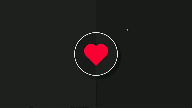
추가 정보 : Heart Beating Animation
나는 이것이 당신의 이미지 애니메이션에 원하는 것이라고 생각합니다. 상단 이미지가 필요하지 않습니다. 바닥 만 사용하세요.
#button{
  width:450px;
  height:450px;
  position:relative;
  top:48px;
  margin:0 auto;
  text-align:center;
  }
#heart img{
  position:absolute;
  left:0;
  right:0;
  margin:0 auto;
 }

 @keyframes heartFadeInOut {
  0%
  {    transform: scale( .5 );  }
  20%
  {    transform: scale( 1 );  }
  40%
  {    transform: scale( .5 );  }
  60%
  {    transform: scale( 1 );  }
  80%
  {    transform: scale( .5 );  }
  100%
  {    transform: scale( .5 );  }
}

#heart img.bottom {
  animation-name: heartFadeInOut;
  animation-iteration-count: infinite;
  animation-duration: 1.5s;
  animation-direction: alternate;

}
<div id="heart" >
<img class="bottom" src="https://goo.gl/nN8Haf" width="100px">
</div>I needed this for a project I was working on. I was trying to make it look as realistic as possible, and this is what I came up with.
@keyframes heartbeat {
    0% {
        transform: scale( .95 );
    }

    20% {
        transform: scale( .97 );
    }

    30% {
        transform: scale( .95 );
    }

    40% {
        transform: scale( 1 );
    }

    100% {
        transform: scale( .95 );
    }
}
animation: heartbeat 1s infinite;
참고URL : https://stackoverflow.com/questions/34762009/pulsing-heart-css-animation
'your programing' 카테고리의 다른 글
| C 또는 C ++로 구조체를 반환하는 것이 안전합니까? (0) | 2020.10.09 |
|---|---|
| 주어진 달의 순간 JS 시작 및 끝 (0) | 2020.10.09 |
| ASP.NET Core 2.0 인증 미들웨어 (0) | 2020.10.09 |
| Python : BeautifulSoup-이름 속성을 기반으로 속성 값 가져 오기 (0) | 2020.10.09 |
| Pandas 반복에 성능 문제가 있습니까? (0) | 2020.10.09 |